See Wendy’s Contentious New Logo
Fast food icon Wendy's is suddenly sporting a contentious new look. As such, the logo revamp has sparked quite a bit of controversy.
This article is more than 2 years old

Fast-food restaurants are doing everything they can to remain relevant in this turbulent economic climate. Wendy’s had the whole internet talking recently with its new design makeover at a London location. After opening its eighth location in Great Britain, the restaurant chain decided to rebrand the shop as an emo callback to the early 2000s. Take a look below.

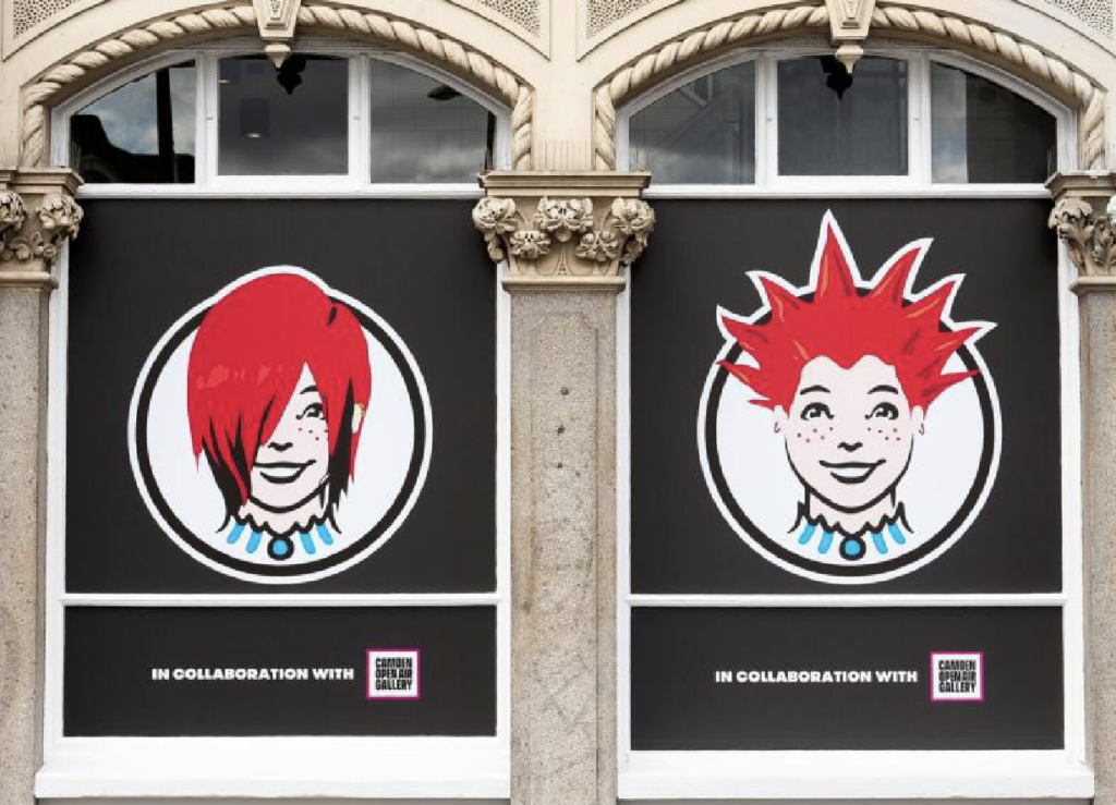
Wendy’s new Camden location is situated in a trendy London area. The neighborhood is known for its youthful demographic as well as a hub for music and fashion. This inspired the Camden locations’ unusual portrait, ushering in an “Emo Wendy” version of the company’s titular character. The angsty interpretation of the iconic redhead is plastered outside the Camden Wendy’s store, sporting a shaggy, red sidebang for the quintessential early 2000’s look. The image of the Emo Wendy circulated widely last month, with many social media platforms chiming in on the bizarre and hilarious new restaurant icon.
So how did Wendy’s decide to issue in this punk-rock version of the character? It all started earlier this year when the restaurant chain teamed up with the ad agency VMLY&R. The partnership brought on Camden Open Air Gallery, a residential artist platform, to design three different versions of the Wendy’s cartoon. The three versions were inspired by punk and rock aesthetics of the early 21st and late 20th centuries, each with their own wild hairstyles to match. The punk, bouffant quiff, and emo Wendy versions were voted on by the public, leading to the Camden Wendy the UK has now.
Tony Barr, Wendy’s senior international marketing director for APMEA & Europe, explained his reasoning behind the unorthodox ad campaign. Barr stated the inspiration from Camden’s “culturally-rich neighborhood,” wanting to provide a store that captured the artistic essence of the community’s history. This led the fast-food icon’s marketing team to partner with local artist organizations to craft new characters for the Camden store. All three looks took off on social media, putting Wendy’s back into the cultural sphere.
Though the Emo Wendy was picked through a popular vote on the company’s website, the actual winner was the punk version with the spiked hairdo. If the punk cartoon one the popular vote, why isn’t she the face of the Camden site? There’s no apparent reason for this decision other than Wendy’s creative team favoring the emo design more. This decision worked out in the company’s favor since the Emo Wendy version has been plastered all over Twitter, Instagram, and TikTok. The angsty Wendy depiction is something fans never expected, which made for a massive marketing campaign for the company’s new stores in the UK.
Though Wendy’s is extremely popular and ubiquitous in the United States, it’s not well-known in other countries. That’s because the fast-food chain operates almost exclusively in North America. The fast-food titan’s stores in the UK officially debuted in 2021, 20 years after abandoning their British stores in 2001. The company currently operates in 30 countries but plans to expand its stores in various European countries over the next few years.
Fast-food restaurants are elevating to more creative levels now that the market is supremely competitive. Wendy’s newest Emo Wendy mascot used the angsty, nostalgic vibe to make a massively successful marketing campaign.


